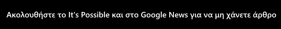
Σε αλλαγή στο logo τους προχώρησαν τα Zara, και αρκετοί είναι οι χρήστες του Twitter που δεν είδαν με καλό μάτι αυτή την αλλαγή. Όπως μπορείς να δεις στα παρακάτω ενδεικτικά tweets, το νέο λογότυπο χαρακτηρίζεται από κάποιους μέχρι και… κλειστοφοβικό.
Το νέο logo αποτελείται ξανά από τα τέσσερα γράμματα «Zara», μόνο που σε αντίθεση με το παλιό το οποίο είχε κυκλοφορήσει το 2011, αυτή τη φορά είναι εμφανώς πιο στριμωγμένα.
Το logo δημιουργήθηκε από την Baron & Baron, της οποίας ο ιδρυτής Fabien Baron, είναι γνωστός για τα «συμπιεσμένα» σχέδιά του, ενώ πρόσφατα επιμελήθηκε την νέα καμπάνια marketing της Zara. Ο Baron έχει βοηθήσει στον σχεδιασμό πολλών διάσημων fashion brands, ανάμεσά τους Dior, Coach και Bottega Veneta.
Zara's new logo is making me claustrophobic. ? pic.twitter.com/uSHylbzNCH
— Howard Pinsky (@Pinsky) January 29, 2019
The new Zara logo is actually me trying to squeeze into their clothes…? pic.twitter.com/KNBR5BHg4F
— P.U. 〽️? (@captl_P) January 29, 2019
Whoever is responsible for the new Zara logo, I just want to talk. pic.twitter.com/DHoff5pLBT
— Impact. (@mindofimpact) January 28, 2019
Zara have updated their logo. pic.twitter.com/GhhQziNV1D
— It’s a Fabio ✌︎⁂ (@fffabs) January 26, 2019
Here’s the old and new #zaralogo. Someone pointed out it’s a copy of #harpersbazaar yes it’s similar but I’m sure EVERY FONT out there can be examined and be similar to another brands. I like how they are touching and the curve at the end of the R. Very “Let’s Tango Amor” lol pic.twitter.com/3NEL4Az0EJ
— Daily Luxe Life (@DailyLuxeTweets) January 29, 2019
Zara logo transformation is making people upset. #zaralogo
— wäfri (@Waff98_) January 30, 2019
Not a fan of the new @ZARA logo. Nice font, composition is too squished #ZaraLogo pic.twitter.com/oK0G6KrvHz
— LLC (@LLClifestyleUK) January 29, 2019